
Release Early and Often
1000 Words | Approximately 5 Minutes Read | Last Modified on November 2, 2018
This is a story about open source software development in archaeology and an example of practicing the software development philosophy known as “release early, release often”.
Back in the early 1990’s, I was exploring the possibility of interpreting a collection of radiocarbon dates as a process, rather than as a collection of events. Eric Komori and I had assembled a database of radiocarbon dates from Hawaiian archaeological sites and were keen to use the database to join a debate over the size of the Contact-era Hawaiian population. We had read a paper by John Rick at Stanford that suggested the idea of using “dates as data.” We thought Rick’s idea could be applied to our database to yield a population growth curve whose shape might contribute to the debate.
At the time, the best practice seemed to be summing the marginal posteriors
yielded by Calib, an approach that eventually generated a large literature and
that archaeologists continue to refine and develop.
As I was working on what to do with the summed marginal posteriors, I had the good sense to ask Caitlin Buck for advice. Caitlin responded that I wasn’t really interested in the marginal posteriors! She claimed I was really interested in properties of the joint posteriors and suggested that I shouldn’t waste my time summing the marginal posteriors in order to infer properties of the joint posteriors. Better, she advised, to investigate the joint posteriors directly.
If I remember correctly, it took me quite a while to think through Caitlin’s
suggestion. First, I had to convince myself that the path Eric and I had chosen
was not the best path. This was hard! Eric and I had written a little computer
program for summing the marginal posteriors reported by Calib and plotting what
we called “annual frequency distribution diagrams.” We were excited that our
program seemed to give us the processual view we were after. I was busy working
on the next step, which we saw as the problem of how to compare annual frequency
distribution diagrams to determine whether or not they were different from one
another. We had worked so hard and the end seemed so close!
Then one day, Caitlin’s insight “clicked” and I was able to see that inferring properties of the joint posteriors by summing marginal posteriors was like reaching behind your head to scratch your ear—it worked, after a fashion, but it was far from the best way to proceed. When Caitlin’s insight “clicked” I could see how to use the Markov chain/Monte Carlo (MCMC) engine at the heart of Bayesian calibration software to investigate the joint posteriors. I had the outline of an algorithm to produce what I would later come to call a tempo plot, but at the time there was no easy access to an MCMC engine, and with life’s contingencies pressing in, I filed the project away with the hope that someone else would take it up and save me some work.
Fast forward a decade and a half and I’ve engaged a debate on the tempo of change in old Hawai`i in the centuries leading up to Captain Cook’s visit in 1778–1779. Figure 1 in that paper summarizes the marginal posteriors, and works after a fashion to carry the argument of the paper, but it would have been better as a tempo plot. It was time to revisit Caitlin’s suggestion.
A survey of the field yielded a couple of interesting data points:
- Bayesian calibration applications now gave access to the MCMC engine with an option to write out its internal state during calculations; and
- archaeologists had shown just a bit of interest in joint posteriors and no one had worked out a procedure for producing a tempo plot.
Implementing the initial version of the tempo plot in R was relatively quick and
easy. As I began to use the tempo plot to explore dating evidence from Hawai`i,
I soon found that the processes associated with different kinds of events had
distinct shapes. Eventually, I distinguished three shapes, which I associated
with processes of tradition, fashion, and innovation and referred to as
long-term rhythms in the development of Hawaiian social stratification. The R
source code I’d developed was released as supplementary material for the
published paper—release early!
Through a bit of serendipity and good fortune, Anne Philippe at Université de
Nantes, Laboratoire de mathématiques Jean Leray saw the paper and built the
tempo plot into an R software package, ArchaeoPhases, which reads the raw MCMC
output of Bayesian calibration software such as BCal, OxCal, and ChronoModel and
provides a set of functions to analyze it. This was a big improvement in two
senses:
- Anne did more than just include my code in
ArchaeoPhases. She also used her considerable mathematics skills to put the Tempo plot on a proper Bayesian footing so the user can choose between the normal approximation and a full Bayesian treatment; and - publishing
ArchaeoPhaseson the Comprehensive R Archive Network established a version control space that automates the release process—it was now possible to release often!
Since that time, the tempo plot has been revised to give the user lots of
control about how the plot looks. Figure 1 shows a tempo plot
gussied up for a dark-themed slide show. Figure 2 shows the same tempo
plot presented in the style of Edward Tufte. Check out the current ArchaeoPhases
release!
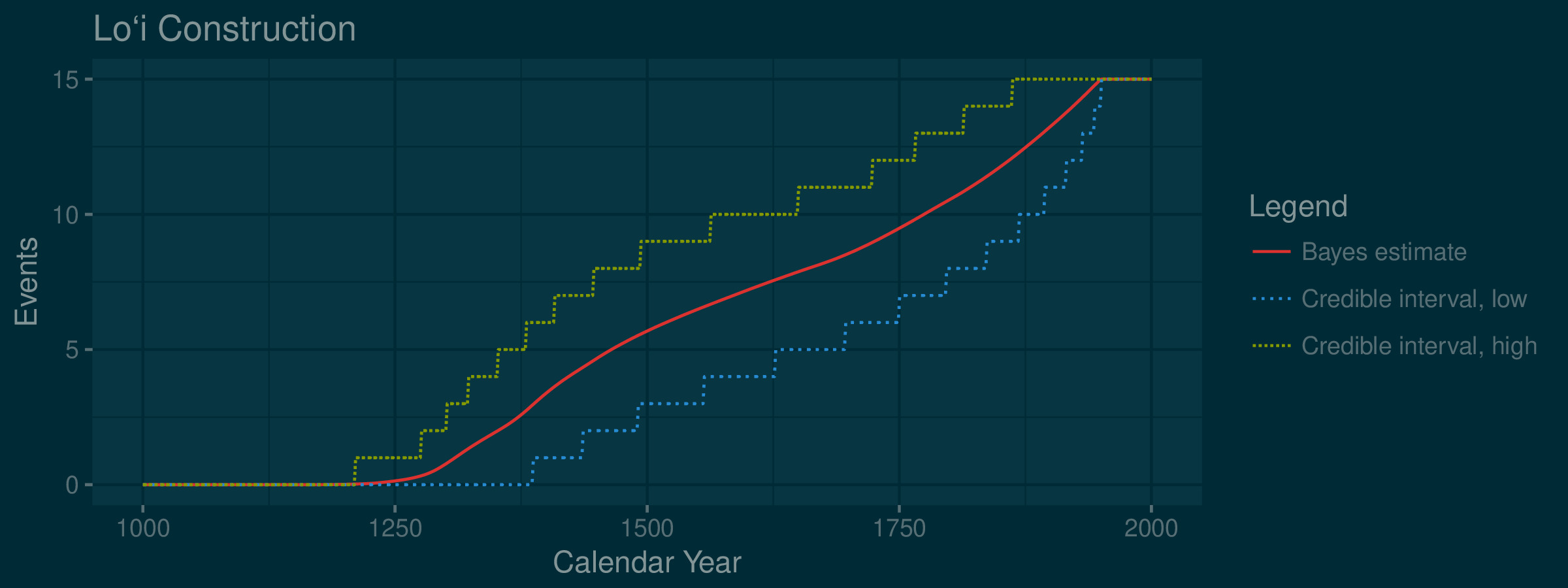
Figure 1: The tempo of pondfield construction plotted on a dark background for a slideshow.
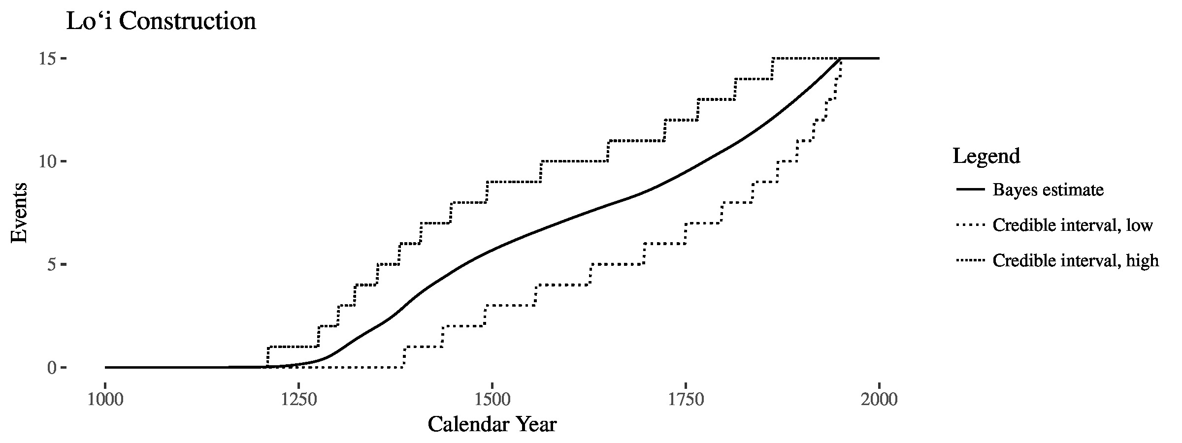
Figure 2: The tempo of pondfield construction plotted in the style of Edward Tufte.
Here is the takeaway: releasing early and often fosters collaboration and progress.